
In recent years, there’s been considerable confusion surrounding the distinction between Color Rendering Index (CRI) and Color Temperature. This article aims to clarify these concepts and simplify your understanding.
Understanding Color
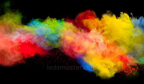 Color is fundamentally a characteristic of light that is perceived by the human eye. It is not a property of the object itself but rather a result of the interaction between light and the object. When light strikes an object, certain wavelengths are absorbed while others are reflected. These reflected wavelengths are what we perceive as color. Without light, even the most vibrant colors become indistinguishable. Therefore, the presence and quality of light are essential for revealing and appreciating color.
Types of Colors
Colors can be broadly categorized into primary and secondary types. Primary colors are the foundation for creating other colors. They include red, blue, and yellow. These colors cannot be created by mixing other colors together but can be combined to produce a range of secondary colors. Secondary colors are created by mixing two primary colors. For instance, mixing red and blue yields purple, blue and yellow make green, and red and yellow produce orange.
In addition to these primary and secondary colors, there are numerous other hues that fall into broader categories like brown, black, white, and grey. Each of these colors can be mixed to produce a wide spectrum of shades and tints, offering a diverse palette for various applications.
Color preferences and choices are often influenced by personal taste and cultural factors. For example, certain colors might be associated with specific emotions or symbolism in different cultures. These preferences can affect how colors are used in interior design, branding, and personal spaces. As we delve further into the article, we will explore these influences in more detail. For now, let’s turn our attention to understanding the differences between Color Rendering Index (CRI) and Color Temperature, two critical aspects of lighting that affect how we perceive color.
What is the Color Rendering Index (CRI)?
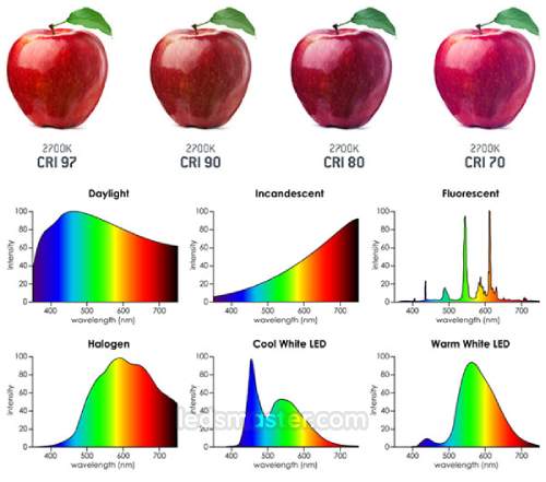 The Color Rendering Index (CRI) is a critical metric used to evaluate a light source’s ability to accurately represent colors compared to natural light. CRI is measured on a scale from 1 to 100, where a CRI of 100 represents perfect color accuracy, similar to that of natural sunlight. This ideal rating means that under such lighting conditions, colors appear as they would in natural daylight, providing the most authentic color representation.
Modern LED lights, while offering significant advancements in energy efficiency and longevity, typically have CRI values ranging from 75 to 90. These values indicate how well the light source renders colors in comparison to natural light. Lights with higher CRI values are generally more expensive due to their superior ability to show colors accurately. For instance, a CRI of 95 or above is often used in high-precision environments such as art galleries, museums, and retail settings where accurate color depiction is essential for the viewer’s experience and the presentation of the items.
A lower CRI implies a diminished capacity to represent colors accurately. For example, under a light source with a low CRI, an apple that appears vibrant “wine red” in natural sunlight might look “dark pink” or altered in hue. This color shift can affect tasks that require precise color differentiation, such as painting, medical diagnostics, or detailed inspection of materials. Therefore, in scenarios where color fidelity is crucial, opting for a light source with a high CRI ensures that colors are displayed true to their natural form.
What is Color Temperature?
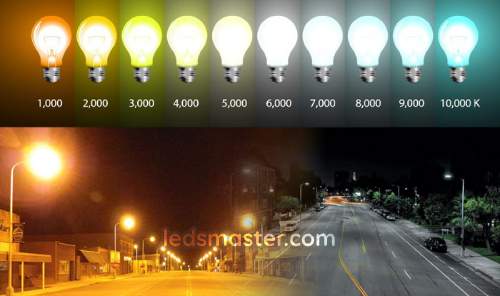 Color Temperature describes the hue or tint of the light emitted by a light source, expressed in degrees Kelvin (K). It is a measure of how “warm” or “cool” the light appears to the human eye. The color temperature of a light source influences the mood and visual clarity of the environment.
Light with a higher Kelvin rating appears cooler and whiter, resembling daylight or the light at noon. Typically, color temperatures above 5000K are considered cool and are often used in settings requiring bright, clean illumination, such as offices, workshops, and medical facilities. Conversely, light with a lower Kelvin rating appears warmer and more yellow, creating a cozy and inviting atmosphere. This type of lighting is often used in residential spaces, such as living rooms and bedrooms, where a softer and more relaxing ambiance is desired. Color temperatures below 3000K fall into this category.
Color Temperature and CRI are distinct yet complementary aspects of lighting. CRI measures how well colors are rendered under a light source, while Color Temperature indicates the overall hue of the light itself. Together, these parameters define the overall quality and suitability of a light source for different applications. Understanding both CRI and Color Temperature is crucial for selecting the appropriate lighting to achieve the desired aesthetic and functional outcomes in various environments.
Types of Lights and Their Applications
Soft and Warm White
Soft and warm white lighting, typically characterized by a color temperature of around 2700K to 3000K, is ideal for creating a cozy, inviting atmosphere in residential spaces. This type of lighting emits a warm, yellow-toned glow that enhances the comfort of a room, making it particularly well-suited for bedrooms, living rooms, and dining areas. The gentle illumination helps to create a relaxing environment conducive to unwinding after a long day or enjoying a meal with family. The warm light also accentuates natural wood tones and rich, earthy colors, adding to the overall sense of warmth and comfort. By providing a soft, diffuse light, it reduces harsh shadows and glare, contributing to a tranquil and pleasant ambiance.
Bright and Cool White
Bright and cool white lighting, with a color temperature typically ranging from 4000K to 5000K, is designed to enhance visibility and create a clean, energetic feel. This type of lighting is particularly effective in workspaces such as kitchens, bathrooms, and offices. In kitchens, bright white light improves visibility on countertops and work surfaces, making food preparation tasks easier and safer. In bathrooms, it provides clear illumination for grooming activities, such as shaving and applying makeup. The cool, crisp light helps to maintain focus and productivity in office environments, making it easier to perform detailed tasks and read documents. Bright and cool white lighting can also be beneficial in areas like garages or workshops where clear, bright light is necessary for working on projects and performing maintenance tasks.
Daylight
Daylight lighting, with a color temperature generally above 5000K, closely mimics natural daylight, providing a bright and neutral illumination that is excellent for a range of tasks. This type of lighting is commonly used in spaces such as bathrooms, kitchens, and garages, where clarity and precision are important. In bathrooms, daylight lighting offers a clear, shadow-free illumination that is ideal for detailed tasks like applying makeup or grooming. In kitchens, it helps to highlight the true colors of food and ingredients, making it easier to cook and prepare meals. Daylight lighting is also favored in reading areas or workspaces where accurate color rendering and high visibility are required. Its bright, neutral tone makes it a popular choice for environments where natural light is limited, providing a vibrant and stimulating atmosphere.
The Role of Interior Designers
Interior designers play a pivotal role in selecting and implementing lighting solutions that enhance both the functionality and aesthetic appeal of a space. The choice of lighting can significantly influence the ambiance and perceived size of a room. By selecting the right type of lighting, interior designers can make a room appear more spacious or cozy, depending on the desired effect.
In addition to the type of lighting, the placement and color of furniture, as well as the integration of natural light, are crucial considerations. Interior designers take a holistic approach, ensuring that all elements work together harmoniously. For instance, strategically placed lighting can highlight architectural features, create focal points, and enhance the overall design of a room. The interplay between artificial lighting and natural light sources is carefully balanced to optimize the visual impact and functionality of the space.
Interior designers also consider how different types of lighting affect the perception of color and texture within a room. They may choose specific lighting temperatures and intensities to complement the materials and colors used in the furniture and decor, creating a cohesive and aesthetically pleasing environment. By meticulously planning and executing lighting designs, interior designers ensure that spaces are not only visually appealing but also practical and comfortable for everyday use.
How to Use Lighting in Commercial Areas
Parking Lots
 Proper illumination helps prevent accidents and deters potential criminal activity, making the parking environment secure and navigable. To achieve optimal lighting in parking lots, a color temperature between 2800K and 3500K is typically used. This range of warm light provides adequate brightness while creating a safe and inviting atmosphere. Additionally, a Color Rendering Index (CRI) of 65 to 80 is commonly chosen, as it offers a balance between adequate visibility and cost-effectiveness.
However, it is important to consider the environmental impact of parking lot lighting, particularly in relation to light pollution. Excessive or poorly directed lighting can have significant effects on local wildlife, disrupting animal migration patterns and altering birds’ natural behaviors. Light pollution can also interfere with the circadian rhythms of both animals and humans, potentially leading to broader ecological and health issues. Therefore, selecting lighting fixtures that minimize light spill and using shielding techniques can help mitigate these negative effects while still providing the necessary illumination for safety and security.
Football Fields
 With the increasing popularity of recreational football, the importance of proper field lighting has become more pronounced. For high-profile and televised matches, high CRI lighting is preferred to ensure optimal visibility and accurate color representation. A high CRI light source provides clear, vibrant illumination that enhances the viewing experience for both players and spectators, making the game more enjoyable and visually engaging.
For regular football games, it is essential to have adequate lighting that ensures good visibility and player comfort. The lighting should be evenly distributed across the field to avoid dark spots and glare, which can affect gameplay and player performance. Uniform lighting also helps in maintaining a consistent visual environment, crucial for both players and officials. Properly designed football field lighting not only enhances the playing experience but also ensures that the field remains well-lit and functional for all types of games.
Hospitals
Hospitals require specialized lighting solutions to support a variety of critical functions within the facility. The lighting needs to be bright, white, and precise to meet the specific demands of different areas, including examination rooms, operating theaters, patient rooms, and intensive care units. Each of these areas has distinct lighting requirements that contribute to both the safety and efficiency of medical procedures.
In operating theaters and examination rooms, mobile luminaires with high output illuminance, typically around 70,000 lux, are used. These intense lights provide the necessary clarity and precision for complex surgical procedures and detailed medical examinations. The bright, focused illumination ensures that medical staff can perform their tasks with accuracy and confidence, enhancing patient safety and procedural outcomes.
In other hospital areas, lighting must support a range of functions, from patient care to administrative tasks. Patient rooms and common areas benefit from softer, adjustable lighting that creates a comfortable and soothing environment, promoting healing and well-being. Proper lighting in hospitals not only aids in medical procedures but also contributes to the overall patient experience, making it a critical component of hospital design and operation.
Conclusion
Distinguishing between Color Rendering Index (CRI) and Color Temperature is crucial for selecting the right lighting. CRI measures how accurately a light source represents colors compared to natural light, while Color Temperature indicates the light’s hue, affecting the atmosphere of a space. Understanding both concepts ensures that lighting not only enhances visibility and functionality but also contributes to the desired ambiance in various settings. Whether for residential, commercial, or specialized environments like hospitals, the appropriate balance of CRI and Color Temperature can significantly impact both aesthetics and performance.