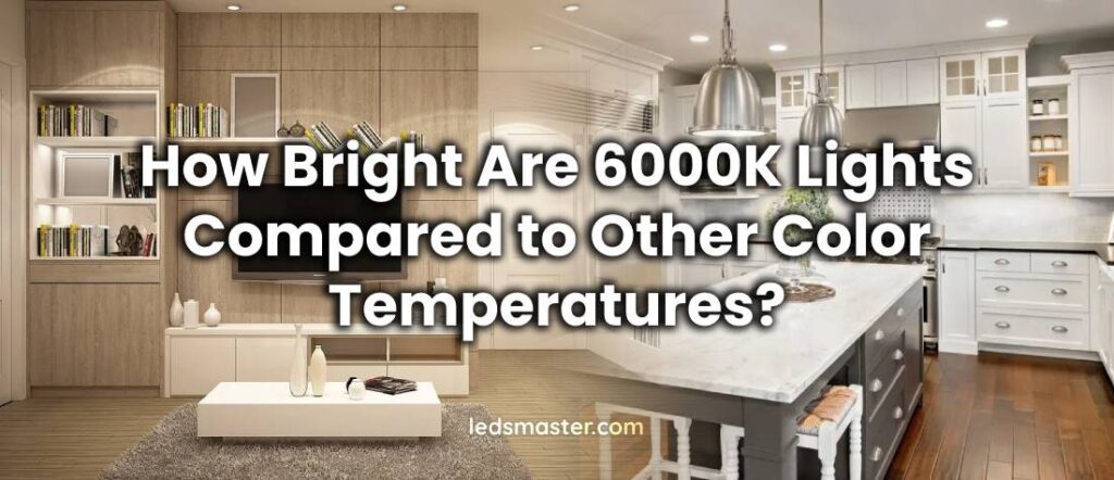
When selecting lighting solutions, color temperature is a critical factor to consider. Color temperature, measured in Kelvin (K), determines the hue of the light emitted by a source, affecting how the light appears and feels in a space. This article explores the brightness of 6000K lights in comparison to other color temperatures, delving into the nuances of brightness versus color temperature, the specifics of 6000K, comparisons with other common color temperatures, factors influencing perceived brightness, and guidance on choosing the appropriate color temperature for your needs.
Brightness vs. Color Temperature
Understanding the difference between brightness and color temperature is essential for selecting the right lighting. Brightness, quantified in lumens, measures the total amount of visible light emitted by a source. It is a measure of how much light is available to illuminate a space. In contrast, color temperature, measured in Kelvin (K), describes the color appearance of the light. It indicates whether the light has a warm, neutral, or cool tone.
Brightness and color temperature are often confused because both impact how light is perceived. However, they are distinct characteristics. Brightness refers to the intensity or quantity of light, whereas color temperature refers to the color quality of that light. For instance, a higher color temperature does not inherently mean a light source will be brighter. Instead, it affects the color tone, ranging from warm (lower Kelvin values) to cool (higher Kelvin values). A 6000K light, for example, does not provide more lumens than a 3000K light if both have the same lumen output; it simply changes the color appearance of the light.
6000K Color Temperature
The 6000K color temperature is often associated with a cool, daylight-like appearance. It produces a crisp, stark white light with a bluish tint, similar to natural daylight on a clear midday. This color temperature is commonly used in settings where high visibility and clarity are crucial. It is prevalent in environments such as office spaces, commercial areas, and various outdoor applications where enhanced visual clarity and contrast are necessary.
Lights with a 6000K color temperature are favored for their ability to provide clear, sharp illumination. The cool white light enhances contrast and makes details stand out more vividly, making it suitable for tasks that require precise visual accuracy. This characteristic is particularly beneficial in environments such as warehouses, manufacturing facilities, and high-detail workspaces where clarity and attention to detail are paramount.
Comparison with Other Common Color Temperatures
To understand how 6000K lights compare with other color temperatures, it’s essential to look at some common options:
| Color Temperature | Appearance | Common Uses | Characteristics |
|---|---|---|---|
| 2700K – Warm White | Warm, yellowish light | Residential spaces (living rooms, bedrooms, dining areas) | Creates a cozy, inviting atmosphere; reduces eye strain; softer, less harsh compared to cooler temperatures. |
| 4000K – Cool White | Neutral white light | Offices, kitchens, retail environments | Balanced illumination; clean, bright light without intense blue cast; suitable for general work environments. |
| 5000K – Daylight | Bright white with subtle blue | Medical facilities, libraries, detailed workspaces | Mimics natural daylight; enhances visibility and contrast; helps with precision and productivity. |
| 6000K – Cool Daylight | Cool, daylight-like with blue tint | Workshops, garages, precision tasks | Provides high visual clarity and contrast; can be harsh or too intense for residential settings; ideal for detailed work. |
2700K – Warm White
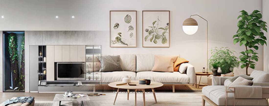
The 2700K color temperature is known for its warm, yellowish light, reminiscent of traditional incandescent bulbs. This hue creates a cozy and inviting atmosphere, making it ideal for residential spaces like living rooms, bedrooms, and dining areas. The warmth of 2700K light fosters a relaxed environment, reducing eye strain and contributing to a more comfortable ambiance. It is notably softer compared to cooler temperatures, making it less harsh and more soothing. This warmth is often preferred in settings where a homely, relaxed feeling is desired.
4000K – Cool White
At 4000K, the light is often referred to as “cool white.” This color temperature provides a neutral white light that sits between the warm tones of 2700K and the cooler hues of higher temperatures. It offers a balanced illumination, making it versatile for various settings. Cool white light is commonly used in offices, kitchens, and retail environments. It provides clarity and brightness without the intense blue cast found in higher color temperatures, making it suitable for workspaces where a clean, bright light is required but without the starkness that can sometimes lead to visual fatigue.
5000K – Daylight
The 5000K color temperature produces a bright white light with a subtle blue tint, closely mimicking natural daylight. This range of illumination is often employed in settings where high visibility and accurate color rendition are critical, such as medical facilities, libraries, and detailed work environments. While it is cooler than 4000K, the light from 5000K is not as overtly blue as 6000K. This temperature helps to reduce eye strain and enhance contrast, making it suitable for tasks requiring precision. It offers a crisp and invigorating light that can help increase alertness and productivity.
6000K – Cool Daylight
6000K lights emit a cool, daylight-like illumination that leans towards a bluish tint. This color temperature is particularly valued in applications where enhanced visual clarity and contrast are crucial. 6000K light is commonly used in environments like workshops, garages, and areas where precision and detail are paramount. However, the intensity of this light can sometimes be perceived as harsh or overly bright for certain settings. In residential or relaxing environments, 6000K might be considered too intense, as it lacks the warmth that softer color temperatures provide. Despite this, for tasks requiring high visibility and focus, 6000K can be extremely effective.

Factors Affecting Perceived Brightness
Several factors influence how bright a light appears, beyond just its color temperature:
Lumen Output
Lumen output is a fundamental measure of how bright a light appears. It quantifies the total amount of visible light emitted by a source. A higher lumen count indicates a brighter light, regardless of its color temperature. For example, a 6000K LED light that produces 3000 lumens will be significantly brighter than a 6000K LED light with only 1500 lumens. This means that, when evaluating lighting options, it’s crucial to consider both lumen output and color temperature to achieve the desired brightness level.
Reflectivity of Surfaces
The reflectivity of surfaces within a space can substantially affect the perceived brightness of a light source. Light-colored or highly reflective surfaces, such as white walls or glossy finishes, will bounce and amplify the light, making the space appear brighter. Conversely, darker or matte surfaces absorb more light, diminishing the overall perception of brightness and making the space seem less illuminated. Therefore, the choice of paint, materials, and finishes can influence how effectively a light source performs in enhancing brightness.
Ambient Light Conditions
Ambient light conditions—existing lighting levels in the environment—play a significant role in how a light source is perceived. In a space that is already well-lit, a 6000K light may seem less intense or even subdued, as its effect is moderated by the surrounding illumination. In contrast, in a darker or poorly lit environment, the same 6000K light can appear more glaring and impactful. This dynamic illustrates the importance of considering ambient light when planning lighting setups, as it affects the overall visual experience.
Light Distribution
The manner in which light is distributed can also affect its perceived brightness. Light sources that are focused and directed, such as spotlights or task lights, create areas of intense brightness that highlight specific areas or objects. In contrast, diffused lighting—achieved through fixtures that scatter light more broadly—provides a softer and more evenly spread illumination. This results in a more balanced and less intense light, which can be beneficial in spaces where a uniform level of brightness is desired.
Choosing the Right Color Temperature
Selecting the appropriate color temperature involves evaluating the specific requirements and ambiance of the space. Here are some key considerations:
Purpose of the Space
The purpose of the space heavily influences the choice of color temperature. For task-oriented environments where clarity and precision are crucial—such as workshops, medical facilities, or laboratories—cooler color temperatures like 5000K or 6000K are preferred. These temperatures enhance contrast and visibility, making it easier to perform detailed work. Conversely, for spaces focused on comfort and relaxation—such as living rooms, bedrooms, or lounges—warmer color temperatures like 2700K are more appropriate. They create a soothing, inviting atmosphere that minimizes eye strain and promotes relaxation.
Desired Ambiance
The ambiance you aim to create significantly impacts color temperature selection. Cooler temperatures, such as 6000K, can energize and invigorate the environment, making them suitable for work areas or locations where alertness is required. These cooler lights can stimulate activity and focus. On the other hand, warmer temperatures foster a more relaxed and comfortable ambiance, making them ideal for residential or leisure areas where a cozy and calm environment is desired.
Energy Efficiency
While color temperature affects the aesthetic and functional quality of lighting, energy efficiency is also a crucial consideration. Modern LED lights are available in a range of color temperatures and offer high energy efficiency, which contributes to lower energy consumption and reduced operational costs. When choosing between different color temperatures, it is essential to evaluate not only the visual and functional aspects but also the overall energy usage and potential savings over time. Efficient lighting solutions help balance performance with cost-effectiveness, ensuring that you achieve the desired lighting effects while managing energy expenses.
Conclusion
While 6000K lights are notable for their cool, daylight-like appearance, they do not inherently offer more brightness than lights of other color temperatures. Instead, they provide a specific color tone that can impact the perceived clarity and sharpness of the light. By understanding the relationship between color temperature and brightness, as well as considering factors like lumen output and the specific needs of your environment, you can make an informed decision about the most suitable lighting for your space. Whether you need the crisp clarity of 6000K or the warm comfort of lower color temperatures, the right choice will enhance both the functionality and ambiance of your lighting setup.